
Problems with Static Advertising Displays Compared With Digital Billboards
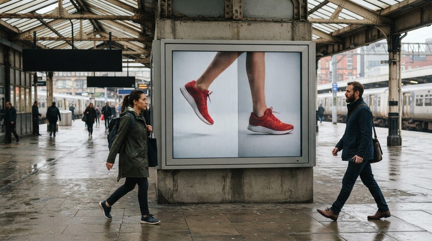
The problems with static advertising displays aren’t that they lack impact; it’s that one image and message must do all the work. A digital billboard can rotate multiple ads in cycles of 6-8 seconds, while a static display keeps the same creative in view. That difference shapes how easily a campaign can adapt and how repeated exposure feels.
Static displays have one clear strength: a focused message stays visible without competing with other ads on the same screen. But the fixed format can feel limiting when a campaign needs fresh creative, changing information, or a more dynamic visual experience. It’s a familiar trade-off for advertisers balancing simplicity and flexibility.
This comparison explains how static and digital billboards differ in flexibility, visibility, campaign strengths, and repeated exposure. You’ll see where static creative can make a strong impression, where its limitations become more noticeable, and how to choose a format that fits the message and viewing environment.
Key Takeaways
- Match the display format to the campaign’s message and how quickly viewers need to understand it.
- Make the main idea and product easy to recognize at a glance, especially in compact placements.
- Refresh creative when repeated exposure makes a familiar message feel stale, and vary more than just the wording.
- Account for outdoor wear when planning a static display, or consider a lenticular format when movement can strengthen the visual story.
Static advertising advantages and limitations
Static displays keep one image and message in place, making a campaign easy to recognize. In the United States, permit and zoning requirements depend on local rules, the sign’s location, and its characteristics.
Creative and Platform Constraints
This comparison is about what the creative can communicate and how platforms deliver it. Static online display ads pair images with a short message and load faster than animated or rich-media ads. The trade-off is limited space and no sequence of frames to develop a longer story.
File limits commonly range from 150 KB to 300 KB, depending on the platform. A 320 × 50-pixel mobile banner has a 150 KB maximum. Compress images to fit the placement while preserving legibility, then review the exported file at its intended size.
Flash banners consumed substantial resources and drained battery life more than other file formats. For Meta 9:16 static ads, keep text and logos out of the top 14% and bottom 35% of the image. These placement constraints differ from a physical billboard’s, where viewing distance and the roadside environment shape readability.
Vandalism, Theft, and Damage Prevention
Protecting a physical display is different from meeting a platform’s upload specifications. Reduce the risk of vandalism or theft by choosing a visible, well-managed location, using secure mounting, and arranging regular inspections. These steps can help reveal loose fixtures, tampering, or surface damage before they undermine the message.
Match the prevention plan to the display’s setting. For example, a sign in an isolated area needs different oversight from one beside a staffed building. Document damage promptly and arrange repairs so a torn, marked, or missing display doesn’t remain part of the campaign.
Static billboard vinyl or paper can fade and deteriorate if left up too long. Inspect the surface and mounting points, and plan a replacement when the material no longer presents the image clearly. Good upkeep addresses physical wear, but it cannot make fixed creative adapt to changing campaign messages.
Image readability and product visibility at small sizes
A small digital ad gives viewers little time and screen space to absorb its message. Aim for one clear idea that can be read in a second or two. For example, a product image, short headline, and single call to action create a clearer hierarchy than several competing claims. Keep the featured product large enough to recognize at a glance.
Placement determines the image format and available space. Common static formats include square 1:1 images at 1080 × 1080 pixels and 4:5 images at 1080 × 1350 pixels. Stories and Reels commonly use a 9:16 ratio. Standard banner dimensions include 300 × 250 pixels, 728 × 90 pixels, and 320 × 50 pixels. Design for the actual placement, rather than shrinking one crowded layout across every screen.
File limits also shape the creative. Static display ad limits typically range from 150 KB to 300 KB, depending on the platform. Compress the image and then inspect the exported file at its intended dimensions; excessive compression can blur product edges or small lettering. A 300 × 250-pixel ad is commonly accepted across programmatic platforms, making it a practical format to consider for broad placement.
HTML5 ads can use animation and multiple frames, while static formats hold one image in view. HTML5 has native browser support and doesn’t require third-party plugins to display animation. Its richer sequence can reveal more product details, but added movement doesn’t automatically improve clarity: the viewer still needs to understand the offer quickly. Static ads are often cheaper than animated ads and suit a direct message; dynamic creative can adapt images or copy for different viewers. Choose based on the product feature that matters most and the campaign’s target, not motion alone.
Keep the creative focused: a good static ad communicates one message that viewers can read in a second or two, without competing messages obscuring it. When online ads direct viewers to campaign landing pages, agencies such as PurpleCow Digital also emphasize keeping the underlying site well-maintained so fast ad clicks lead to seamless user experiences.
Static ad fatigue and repeated exposure
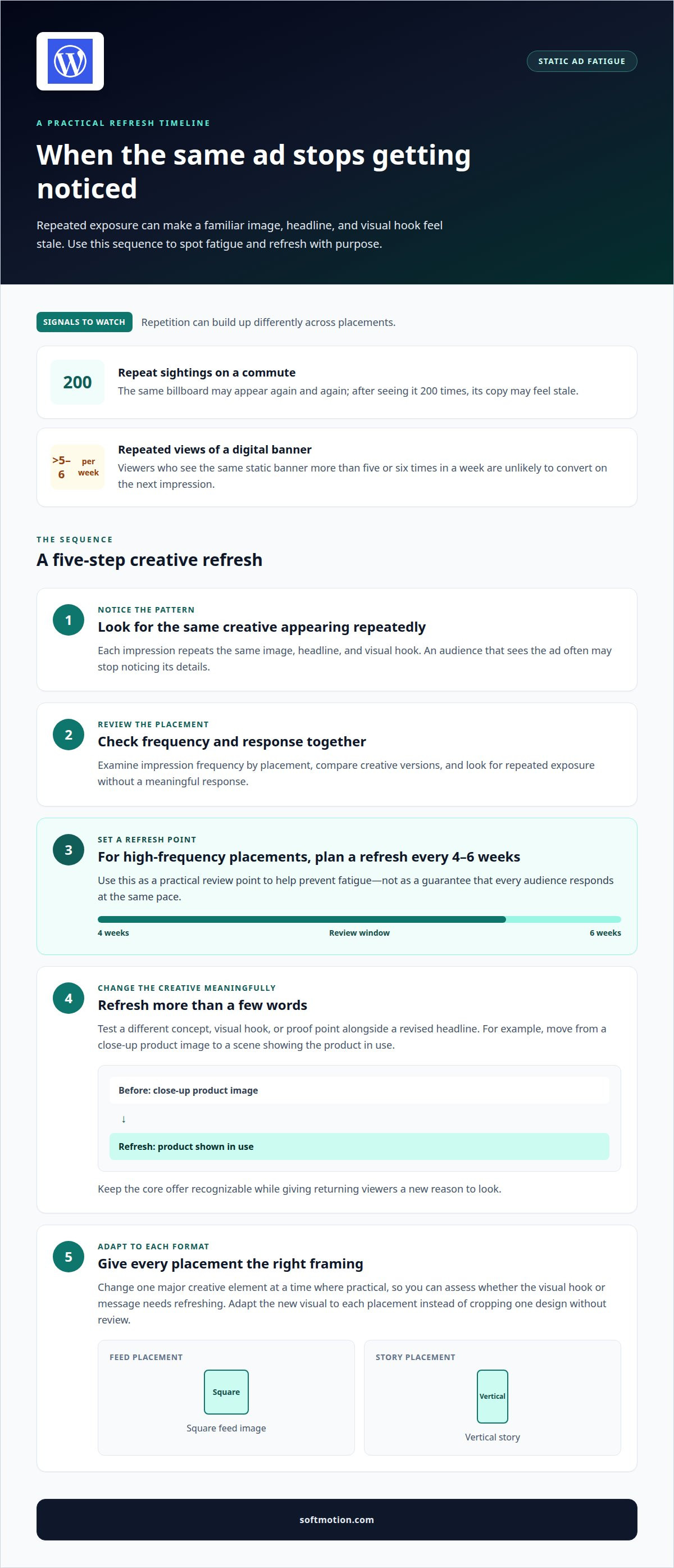
A static creative can become familiar before its message has finished working. Each impression repeats the same image, headline, and visual hook, so an audience that sees it often may stop noticing its details. On a daily commute, the same billboard can appear again and again; after seeing it 200 times, its copy may feel stale.
Frequency matters in digital placements, too. Viewers who see the same static banner more than five or six times in a week are unlikely to convert on the next impression. Monitor repeated exposure, especially when one placement delivers the same creative to a concentrated audience.
For high-frequency placements, refresh static ad creative every four to six weeks to help prevent fatigue. Treat this as a practical refresh point, not a guarantee that every audience responds at the same pace. The placement, campaign duration, and repetition all affect how quickly an image feels overfamiliar.
A refresh should change more than a few words. Test a different concept, visual hook, or proof point alongside a revised headline. For example, a campaign could shift from a close-up product image to a scene showing the product in use. Keep the core offer recognizable while giving returning viewers a new reason to look.
Use a simple review routine: examine impression frequency by placement, compare creative versions, and replace the image when it has been seen repeatedly without a meaningful response. On platforms serving multiple formats, adapt the new visual to each placement instead of cropping one design without review. A square feed image and a vertical story need distinct framing.
When testing variations, change one major creative element at a time where practical. A new image paired with the same message can reveal whether the visual hook needs refreshing; a different proof point can test the message itself. This gives each impression a clearer purpose and helps distinguish creative fatigue from a mismatch between the ad and its audience. For teams managing specialized campaigns such as talent attraction, consultancies like GBS Worldwide apply targeted recruitment media management and employer brand strategy to optimize creative rotations and prevent audience fatigue.
What weather and environmental damage affects outdoor static displays?
Outdoor exposure can gradually alter a printed display’s surface and appearance. Sunlight can fade colors, while rain, wind, and airborne dirt can leave marks or stress exposed edges. Vinyl or paper left up too long can fade and deteriorate, so the display’s condition matters as much as its original artwork.
Start an inspection by viewing the entire sign from the audience’s usual approach. Look for uneven color, peeling edges, creases, tears, and dirt obscuring the message. For example, fading across a logo can weaken recognition even when the rest of the image remains legible. Record the affected area and compare it with the original design to decide whether the display still communicates clearly.
Environmental wear can also affect how a display looks. A loose edge or damaged section draws attention away from the message; a faded product image may no longer match the intended campaign impression. Inspect the printed surface and visible mounting points, then address damage before it spreads or makes the creative difficult to read. The right response depends on the material, the display’s condition, and its exposure.
Build maintenance into the campaign plan rather than waiting for obvious deterioration. Consider exposure to direct sunlight, rain, wind, and nearby dust when setting inspection intervals. After severe weather, assess the surface and mounting points before assuming the display remains intact. Replace or refresh the creative when fading, tears, or stains compromise its message; worn material can make a campaign appear neglected.
Weather planning addresses the physical surface, while creative choices shape the viewer’s experience. If a campaign needs a more dimensional visual treatment than a conventional printed image, explore Advertising Lenticular Displays as another way to present the message.
Softmotion: Advertising Lenticular Displays
Softmotion creates Advertising Lenticular Displays for campaigns that need more visual dimension than a single fixed image can provide. Lenticular printing shifts the image as viewers move past or change their viewing angle, bringing motion to a physical display. It can suit a campaign centered on a product reveal, changing visual, or movement-led idea. A conventional static display may be a better fit when one clear image is all the campaign needs.
Choose a format based on the campaign’s visual idea and the space where people will encounter it. Softmotion develops advertising displays that turn static surfaces into more dynamic visual experiences. If that approach fits your campaign, contact Softmotion to discuss your display.
Choose the visual direction that fits your next campaign
The problems with static advertising displays often point to a creative decision, not one format that works for every campaign. A fixed image can serve a focused message; a campaign built around visual change may call for a more dimensional approach. Consider what viewers should notice first, how the display fits its setting, and whether the creative needs to evolve beyond one image.
Softmotion’s Advertising Lenticular Displays bring motion-driven imagery to advertising, while Architectural Lenticular Installations and Fine Art Lenticular Prints bring lenticular visuals into built spaces and artistic work. Each offers a distinct way to shape how people encounter an image. The next step is to connect your campaign’s purpose with the visual experience you want to create.
Contact Softmotion to discuss your display needs and explore a direction that brings your idea into focus. A thoughtful creative choice can turn an ordinary surface into a more memorable encounter.
Frequently Asked Questions
What are the main problems with static advertising displays?
The main drawbacks are limited flexibility, repeated creative, and reduced clarity when a message or image is poorly suited to its viewing conditions. A roadside display, for example, must communicate quickly without relying on small details. Outdoor materials can also fade or deteriorate. These problems with static advertising displays matter most when a campaign needs changing information, frequent creative variation, or a message that unfolds over time.
How often should static advertising displays be replaced or updated?
Update high-frequency digital static creative every four to six weeks to help reduce fatigue. For physical displays, use their condition rather than a fixed calendar: replace the artwork when fading, tears, stains, or other wear interfere with the image. A seasonal promotion may need a planned creative change, while a durable message can remain if it stays legible and relevant to its setting.
What accessibility and readability issues affect static advertising displays?
Small text, crowded layouts, weak contrast, and important information shown only through color can make a display harder to understand. Keep the headline concise, separate the main message from supporting details, and use strong contrast between text and background. For example, viewers passing a roadside sign shouldn’t need to distinguish subtle color changes or read fine print to understand its central message.