
Lenticular Office Branding Examples That Engage Visitors
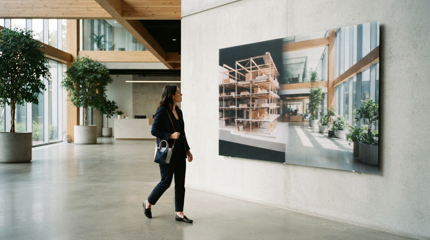
A wall can do more than carry a logo. Lenticular office interior branding uses printed images aligned with a clear lens of fine ridges to reveal different views or create an impression of movement and depth as people change their viewing angle. It turns a familiar surface into a visual experience that responds to visitors’ movement.
A sign delivers a fixed message, while a screen can change its content. A lenticular display offers another kind of visual interaction: its image shifts as someone walks past, inviting a second look without a screen or power cord.
Learn how lenticular displays work, where they can make office branding more engaging, and how they compare with standard signs and digital screens. You’ll also find practical ideas for lobbies, hallways, and other spaces where changing imagery can bring a company story to life.
Key Takeaways
- Understand how a ridged lens can reveal different images or create a sense of movement as visitors change their viewing angle.
- Match artwork size and viewing distance to the space so the visual effect can be experienced comfortably.
- Choose between a static sign, a screen, and a lenticular display based on the kind of attention and interaction you want to create.
- Explore how lobbies, corridors, and event spaces can use shifting visuals to bring a company story or message to life.
What Is a Lenticular Display?
Lenticular printing pairs interlaced images with a clear lens embossed with fine ridges, called lenticules. Those ridges direct light differently as viewers move, revealing a change between images or creating an illusion of movement or depth. A single panel can present 2-3 images, turning a flat graphic into a shifting visual experience.
Size and viewing distance work together. Large-format wall art needs 4 to 6 feet of viewing clearance for comfortable viewing. In a narrow hallway, a 16×24 print can suit viewers passing close to the lens. Lens pitch also matters: 10-20 LPI suits larger displays viewed from a distance, while 40-75 LPI suits smaller panels or closer viewing. For example, a lobby wall viewed across an open area calls for a different setup than a hallway panel seen at arm’s length.
Design each image around the intended viewing path. Artwork must be aligned so the image changes cleanly as someone moves. Resolution should suit the final dimensions and viewing distance, since fine details are more noticeable up close. Include bleed, meaning artwork that extends beyond the finished trim edge, to avoid unprinted slivers after trimming. File settings depend on the production setup.
Durability and cleaning depend on the finished construction and office conditions, including sunlight and physical contact. Follow the care method specified for the panel rather than assuming its ridged lens can be cleaned like ordinary glass.
Planning, production, and installation follow a clear sequence:
- Set the location, viewing distance, message, and number of images.
- Prepare and align the artwork, then review a proof before production.
- Produce the panel and install it in the selected position.
Comparison with standard signage and digital screens
Standard signage presents one static message, making it useful for immediate wayfinding, such as directing visitors from a lobby to a meeting room. Lenticular graphics add an optical effect: as someone changes position, the lenses reveal different images or create apparent motion. The message can stay clear while the visual invites a second look.
A digital screen can change content over time and display animation. A lenticular panel creates a dynamic impression through physical perspective and ambient light, without power. That distinction matters in reception areas where a screen’s changing content may compete with other activity, while a shifting image can make one wall feature memorable. While modern digital screens often rely on active streaming infrastructure—such as the digital services provided to online media entrepreneurs by IPTV Reseller Store—lenticular graphics deliver motion and depth without ongoing network feeds or electricity. Lenticular displays have been described as achieving 3x longer viewer engagement than standard flat signage, though results vary by context.
Outdoor retail example: Situation: a shop window needs to catch the attention of passersby. Action: a lenticular sign combines two product or campaign images in one graphic. Result: the image shifts with the viewer’s position, creating a motion effect without a screen. Outdoor placement requires planning for lighting, environmental conditions, and durability; harsh glare can obscure the transition.
Office wall graphics combine printed images with a clear plastic lens embossed with fine ridges. Installation depends on the panel design and site conditions, including the wall surface and intended viewing position. These choices shape how the graphic is presented, since no single mounting method suits every space.
In the US, look for a specialist in custom, large-format lenticular printing for office applications. The right production approach aligns the artwork and lens for the intended viewing angle, rather than treating the panel like ordinary flat signage. For an architectural wall application, explore custom lenticular wall graphics as a way to bring a shifting visual into a fixed space.

Audience interaction and visual engagement
A striking display gives visitors a reason to look twice. In a reception area, for example, an image can shift from the company’s origins to its present-day work as people walk past. That transformation turns one wall into a concise story connected to the space. The changing image can catch attention without asking visitors to stop and operate anything.
Placement shapes the experience. Hallways, entryways, staircases, and open transitions let people encounter a graphic from different angles as they move. A vertical panel beside a corridor, for example, can show one view to someone approaching and another to someone leaving. A display behind a reception desk may be seen mainly from one position, so its effect should suit that fixed perspective.
Illustrative lobby scenario: Situation: Visitors pass a plain wall on their way to meeting rooms. Action: The artwork pairs an image of the company’s people with a message about its work, designed around the corridor’s viewing path. Result: The shifting image gives guests a point of interest and introduces the organization without adding another screen.
Materials and format influence how the visual reads. A broad wall can carry a larger narrative, while a narrow panel may focus on one product, place, or idea. Keep essential wording brief and give each image a clear purpose, since dense copy competes with the changing effect. One view might establish a challenge, while another reveals the organization’s response.
Lighting also affects engagement. Harsh glare can mask or distort the optical shift, so a position facing an unshaded window may weaken the effect. Consider the light and visitor route together when choosing a location. This helps keep the artwork legible as people approach, pause, and walk past.
What are common uses of lenticular graphics in office interiors?
Lenticular office interior branding can create a visual thread from the entrance to shared spaces. In a lobby, a panel might connect the company’s identity with its work; in a corridor, a sequence of images can reflect a milestone or workplace value. The setting determines whether visitors pause to look or experience the image as they pass.
Lobby example: Situation: guests enter a reception area with little context about the organization. Action: create artwork that shifts between a concise brand message and an image of the company’s work. Result: the reception wall introduces both ideas in one visual feature. For lenticular office interior branding, keep the message brief enough to read at a glance.
Hallway example: Situation: employees and guests move through a corridor between meetings. Action: use a visual transition to connect a company milestone with a current initiative. Result: the story unfolds along a familiar route, giving the corridor a purposeful identity. A well-planned lenticular office interior branding concept can feel integrated with the space rather than added as an afterthought.
Event example: Situation: an office hosts a corporate gathering with a registration area and sponsor wall. Action: adapt the imagery to the event theme, such as transitioning between a sponsor identity and campaign message. Result: one panel can welcome attendees and communicate event information without separate graphics for each view.
Seasonal promotions can also refresh a visual story. Pair a lasting brand image with a timely message, and plan each view for the display’s location. A corridor favors imagery that reads during movement, while a reception area can support a more detailed visual for guests who pause. For an office or event environment, plan a lenticular interior display around its location, audience, and brand story.
Softmotion
Softmotion turns office walls and visitor spaces into visual stories through lenticular work. For a lobby, corridor, or shared interior, the key is matching the artwork to the viewing path, message, and character of the space. Architectural Lenticular Installations bring this approach into the built environment, while Advertising Lenticular Displays present a brand or campaign through shifting imagery.
The right approach depends on what visitors should notice and remember. A company story may call for images that reveal a change as people move; a reception display may need a more focused visual statement. Softmotion creates large-format lenticular printing and immersive visual installations for projects that benefit from this dimensional approach.
To discuss a lenticular concept for your office, contact Softmotion.
Give Your Office Story a New Dimension
The strongest lenticular office interior branding starts with a clear intention: decide what visitors should notice, feel, or remember as they move through your space. Then shape the imagery around that moment. A reception area might introduce your organization, while a corridor can reveal a story in motion. The display should serve the visitor’s experience, not compete with it.
Softmotion creates Advertising Lenticular Displays, Architectural Lenticular Installations, and Fine Art Lenticular Prints. Each brings images into a physical environment in a different way, from communicating a brand message to creating an expressive visual feature. Start by considering the space and the story you want it to tell.
Ready to explore what could work for your office? Contact Softmotion about office branding to discuss your direction. A considered visual can give visitors a fresh way to experience your space.
Frequently Asked Questions
What is lenticular printing for office interior branding?
Lenticular office graphics respond visually as people move around them. The artwork is prepared so a lens presents different views from different positions. In a workplace, a reception feature might show a company’s identity from one angle and its work from another. The result is a physical display designed for the space, not simply a flat image.
How does lenticular office signage change images or messages when viewed from different angles?
The lens directs light from the printed artwork toward the viewer differently at different angles. As someone moves, one prepared view gives way to another. This optical effect doesn’t require animation on a screen. For example, a visitor approaching a wall graphic might first see a logo, then a second image as they pass it.
How does lenticular printing compare with traditional office signage, murals, and digital displays?
Traditional signs prioritize a stable message, while murals provide a fixed image across a wall. Digital displays can change electronic content; lenticular graphics shift with the viewing angle. Choose the format for its purpose: a room number should stay easy to read, while a reception feature can use changing imagery to tell a brief brand story. Each option creates a different visitor experience.
What image resolution, viewing distance, and angle are needed for effective lenticular graphics?
These choices depend on the finished artwork’s size and where people will see it. Artwork viewed up close needs enough detail to keep logos and small elements clear. Plan the main viewing path, then compose images so essential text doesn’t cross a visual transition. A proof viewed from the intended position can show whether the image sequence reads clearly.
What are the design and accessibility considerations for lenticular office branding?
Keep essential information understandable in a single view. Don’t make a changing image the only way visitors can find a room, identify a reception desk, or understand an important instruction. Use clear contrast, concise wording, and imagery that supports the message. For example, pair a shifting brand visual with separate, consistently placed wayfinding signs so visitors can enjoy the artwork without relying on it for directions.